The Art Gallery of South Australia website
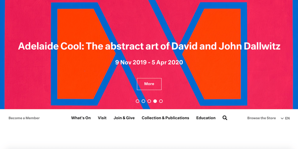
This week’s post looks at the Art Gallery of South Australia’s website. The site implements an ambiguous scheme and a hierarchical structure. The navigation bar is located at the top and scrolls with the page which is useful as you can always navigate to another section regardless of how far down the page you are. The type of hierarchy is broad and shallow as each page can be navigated to within a few clicks. It adheres to the ‘three click rule’ wherein users are able to find what they are looking for in three clicks or less, ultimately reducing the potential that they will abandon their search (U.S. Department of Health & Human Services, n.d.). The site also has breadcrumb navigation which helps orient the user to their location within the website. The branding on the home page is not immediately apparent when viewed on my browser. This is highlighted in the above image showing the default view when landing on the front page. Instead the institution name appears after scrolling further down the page. In terms of accessibility there are multiple languages available, but some errors were identified using the Web Accessibility Validation Evaluation tool (WebAIM, n.d.) including low contrast between text and background in sections and small text headings. This may limit the accessibility for people with a vision impairment.
References
WebAIM. (n.d.). Web accessibility validation evaluation tool. https://wave.webaim.org/
U.S. Department of Health & Human Services. (n.d.). 3-click rule. https://www.usability.gov/what-and-why/glossary/3-click-rule.html#

Good discussion of this website and also use of an accessibilty web tool to evaluate the site. I hope you found this a useful activity.
LikeLike